
Using colour interior design to your advantage
Whether it’s wallpaper or curtains – choosing the right colour matters. These days neutral colour schemes are considered incredibly contemporary. A white leather sofa, light pine units and the odd silver framed mirror/photo frames dotted around the place provide a calming and restful environment after a long day at the office. For those of us who are inspired by colour, this kind of backdrop can prove a tad – dare we say – boring?! Using colour interior design to your benefit is an art, lets see how.
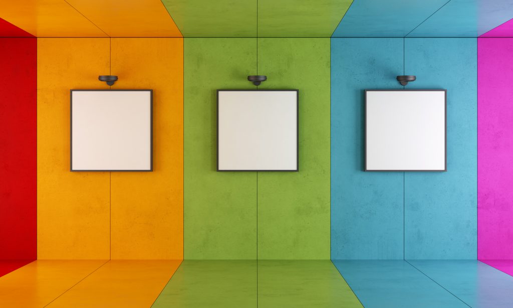
Less is more
So how can we get our colour fix without ruining the overall tranquil look of our rooms? Well, we introduce it in the form of an accent colour i.e. four or five objects in the room with the same colour (or shades of the same colour) so that they ‘pop’ rather than overwhelm.
This could be in the form of accessories such as a table lamp (or two), a picture frame, cushions and a vase. Even though it’s tempting to buy lots of lovely objects in your favourite colour, try and remember the golden rule – less is more i.e. it’s better to have five objects than 10.
Make it balance
But it’s not just about numbers; we also have to make sure those coloured items are balanced throughout the space (rather than all sitting in the one corner or on the coffee table in the centre of the room). We think the following are excellent examples of how to introduce colour into a room. See if you agree.
More than one accent colour
![m_12321_Carnaby_Walnut_Dining_WEB[1]](http://www.valefurnishers.co.uk/inspiration/wp-content/uploads/2016/05/m_12321_Carnaby_Walnut_Dining_WEB1.jpg)
This room’s main accent colour is blue but green and red are also cleverly introduced sparsely. It’s such a large, bright room with the rest of the backdrop in neutral shades that all three colours have the space to mingle here: Vale Furnishers.
![Grey-living-room-with-yellow-fireplace[1]](http://www.valefurnishers.co.uk/inspiration/wp-content/uploads/2016/05/Grey-living-room-with-yellow-fireplace1.jpg)
An excellent example of an eye-popping accent colour, this yellow fireplace jumps out against the grey palette of the rest of the room. It shows that the accent colour can also be a large object. The other two ‘canary yellow’ accents in the room for balance are yellow cushions and a yellow coffee table vase. Blue is also doing a bit of a thing here, but it’s a secondary accent: housetohome.co.uk
![iStock_000008759396_Medium-1080x810[1]](http://www.valefurnishers.co.uk/inspiration/wp-content/uploads/2016/05/iStock_000008759396_Medium-1080x8101.jpg)
This graduating light to bright blue feature wall in the next image works beautifully with the dynamic orange chair, balanced with the co-ordinating clock. The white table and light pine floor are neutral enough to allow both colours to pop: Cocontest
![L_7128_Cork_Living_and_Dining_Range_WEB[1]](http://www.valefurnishers.co.uk/inspiration/wp-content/uploads/2016/05/L_7128_Cork_Living_and_Dining_Range_WEB1.jpg)
The blue walls in this next photograph are several shades lighter than the blue on the chair cushions but the overall scheme still works beautifully because the colours are so far apart – and again the rest of the room is a warm wooden neutral offset with a cooling white neutral: Vale Furnishers
We hope the above images have given you an idea of what we mean by introducing a ‘pop’ of colour. Meanwhile, when inspiration strikes, why not do some popping yourself – over to our site at Vale Furnishers, and get cracking with some of your own creative colour schemes.
Get more Inside Inspiration
